.png)
FAQ Page
Client
DEPOT
Year
2022
Service
- User Experience - Component Design - Specification Documentation
I was responsible for creating the section from scratch, including a feature for filtering questions and a list of questions and answers. Through research, wireframing, design, development, testing and launch, I was able to deliver an easy to use and visually pleasing FAQ section that allows users to quickly and easily find the answers they need. The main goal was to provide the best user experience and make it easy for users to find the answers they need.
Design workflow:
- Research: Look at other FAQ sections of websites for inspiration and gather information on what makes a good FAQ section.
- Wireframe: Create a wireframe of the new FAQ section, including the layout, filtering feature, and list of questions and answers.
- Design: Using the wireframe as a guide, create a visual design for the new FAQ section. Make sure it adheres to the new design guidelines and provides a visually pleasing user experience.
- Develop: Implement the new FAQ section on the DEPOT website, including the filtering feature and list of questions and answers.
- Test: Test the new FAQ section with a small group of users to gather feedback and make any necessary improvements.
- Launch: Once you are satisfied with the final result, launch the new FAQ section on the DEPOT website.
Research
For start I looked for the websites that has similar product line and have large user base.
IKEA
Pros:
- Clear and organized layout, making it easy to find specific information
- Use of categories to filter questions
- Good use of graphics and visual elements to enhance the overall user experience
Cons:
- Some of the answers may be too brief and not provide enough detail for certain questions
Amazon
Pros:
- User-friendly search functionality that allows users to quickly find answers to their questions
- Detailed answers that provide comprehensive information
Cons:
- The page can be overwhelming due to the large amount of information available, making it difficult to find specific answers quickly
John Lewis & Partners
Pros:
- Clear and organized layout, making it easy to find specific information
- Use of categories to filter questions
- Good use of graphics and visual elements to enhance the overall user experience
Cons:
- Some of the answers may be too brief and not provide enough detail for certain questions
Argos
Pros:
- Clear and organized layout, making it easy to find specific information
- User-friendly search functionality that allows users to quickly find answers to their questions
- Good use of graphics and visual elements to enhance the overall user experience
Cons:
- Some of the answers may be too brief and not provide enough detail for certain questions
B&Q
Pros:
- Clear and organized layout, making it easy to find specific information
- Use of categories to filter questions
- Good use of graphics and visual elements to enhance the overall user experience
Cons:
- Some of the answers may be too brief and not provide enough detail for certain questions
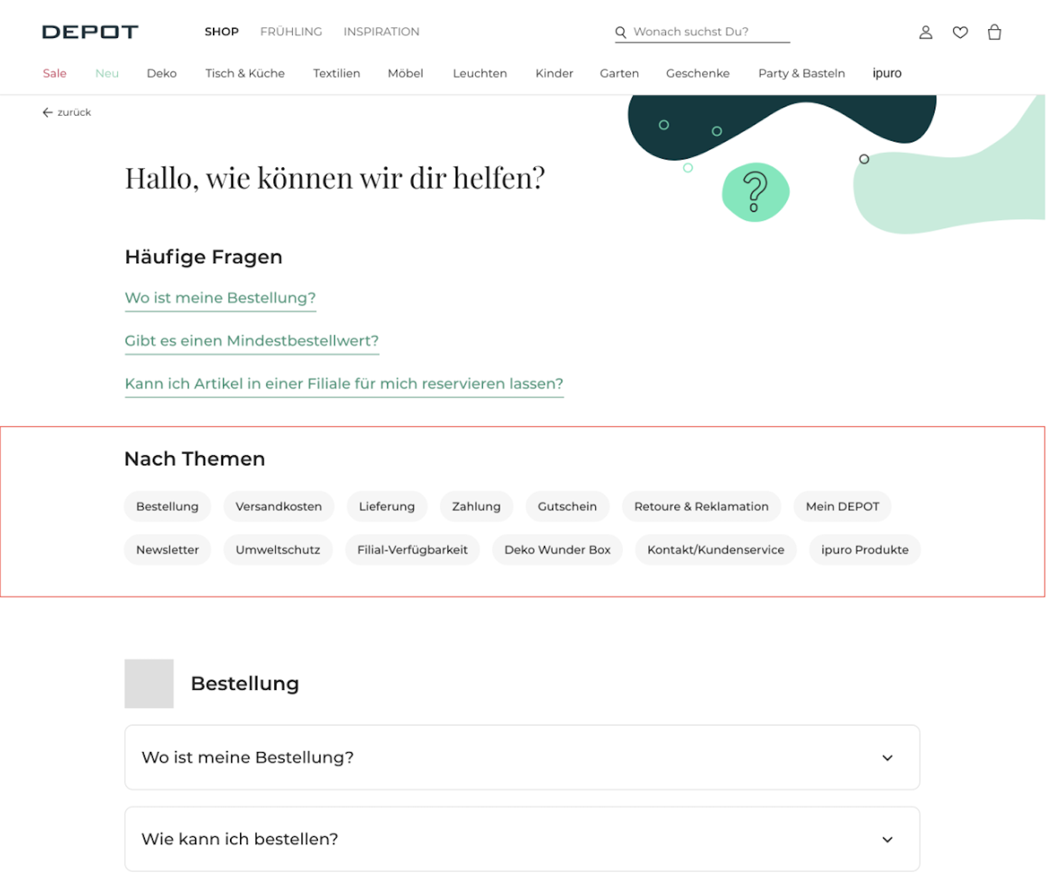
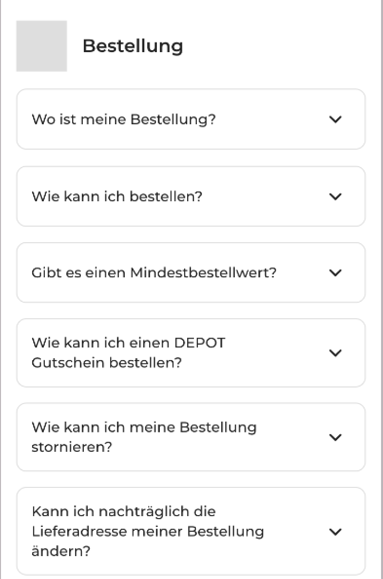
The current problem with the Depot page is that it's difficult to find answers and search for them. The goal is to make the FAQ page concise, accessible, and provide a more efficient way to find answers quickly. Based on the pros mentioned earlier, the page should have a clear and organized layout, making it easy to locate specific information. Using categories to filter questions can be useful, and the answers should be detailed and provide comprehensive information. To enhance the user experience, one suggestion could be to display the top 3 most recent questions at the top of the page, along with the ability to filter based on the categories offered for better navigation.
Wireframe

Design
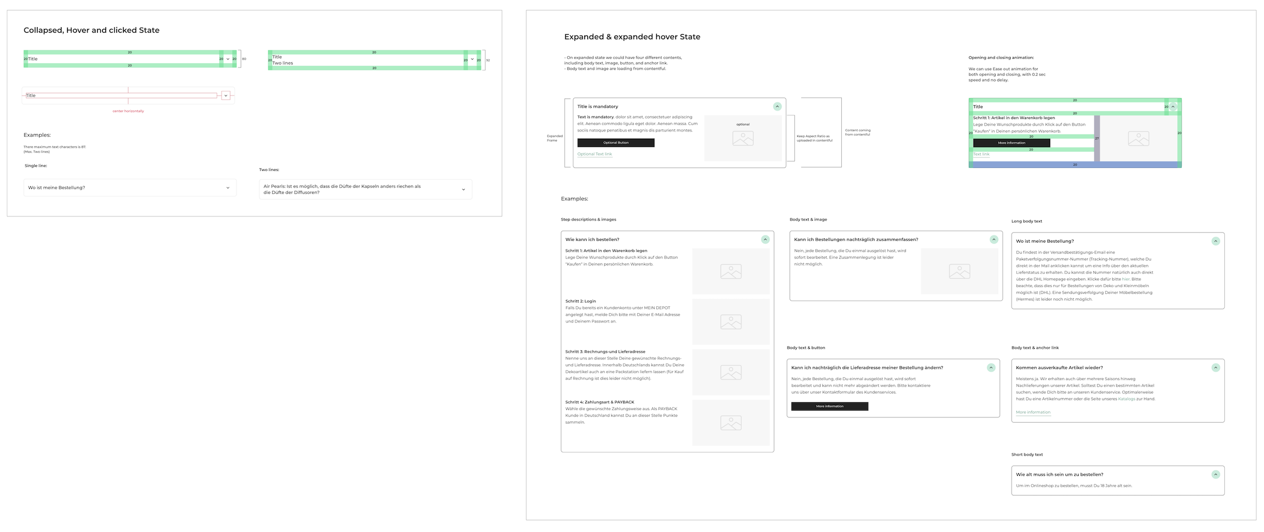
Accordion List
Regarding the design, I started by specifying the Accordion List component and how it should behave in different states. To begin, I defined the component specifications in terms of size and spacing.

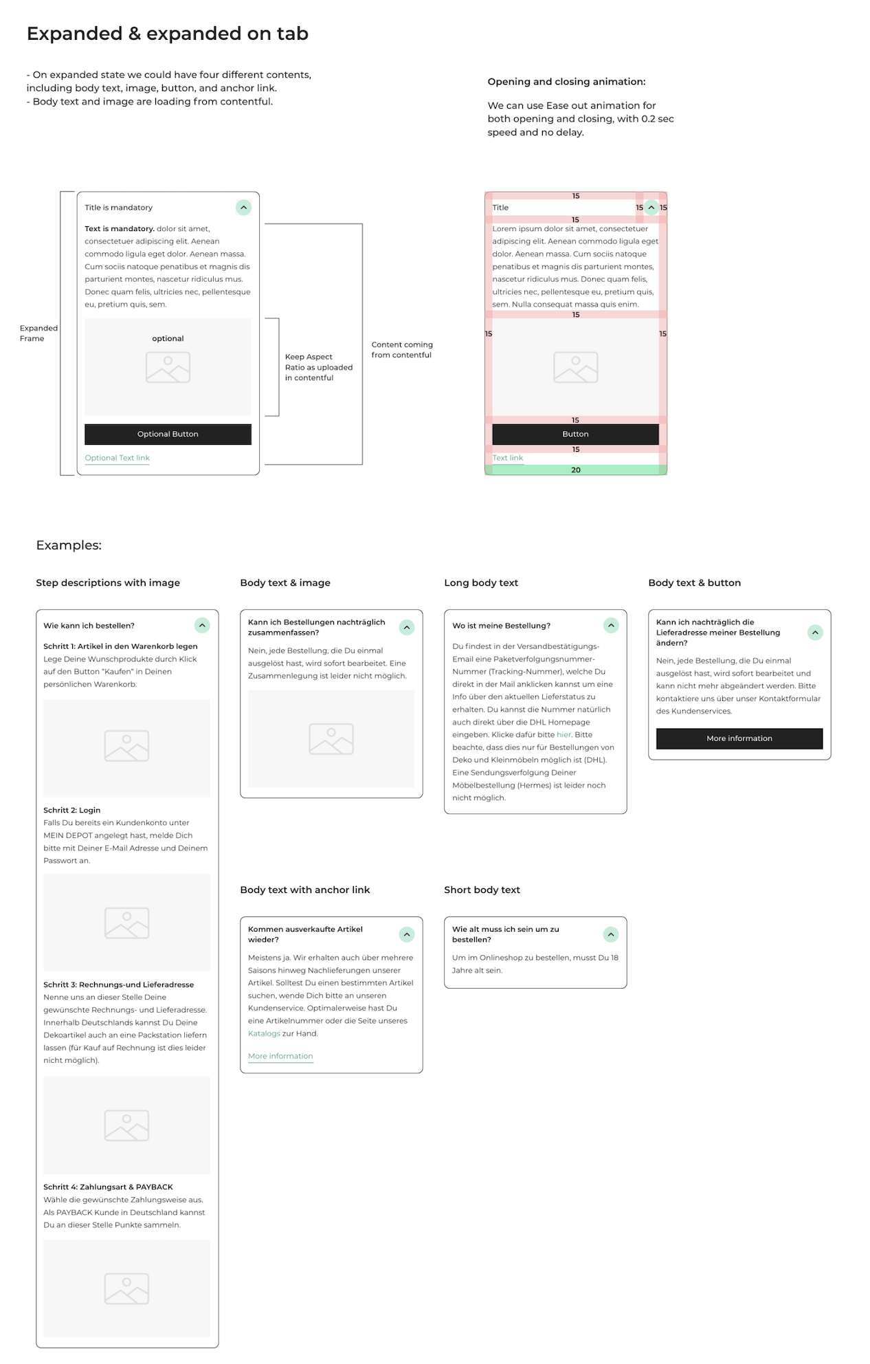
In each stage of collapsed, pressed and expand the Accordion component should have different theme and it's explained as below:

This component also has interactive effects to provide users with a better experience. One of the modern interactive effects introduced in Google Material Design is the ripple effect. Whenever a user clicks on an accordion tab, the ripple effect immediately starts from the point of the click with an animation speed of 200 milliseconds and expands to the bounds of the component. The expand and collapse animation also follows the same animation speed of 200 milliseconds.

I started with the design for mobile and modify it for desktop and website interaction as well.


Pill Buttons
The purpose of the filter buttons is to allow the user to categorize the FAQ page based on the categories provided by Depot, making it easier for the user to find the correct answer.


Test
For the test, I created a prototype and tested it within the team. The main goal of this testing was to understand how users feel about the new redesign and if the new way of filtering and categorizing questions makes any difference in their perspective.
The results were as follows:
Pros:
- The top 3 questions are very useful for seasonal sales and will help us during high-volume purchases during Christmas.
- The category filter was useful for quickly finding my question.
- The smaller screen view shows more questions and is less overwhelming with fewer text blocks.
- I like the new, modern look of the page.
Cons:
- I still had to search for my answer and would appreciate a search option to quickly find my question.
- I would like better access to customer service in the FAQ page, including an option to send a query with the context of the question I found or related to the item I purchased.
Result
As a result, we decided to proceed with the current redesign, as it is an improvement over our current FAQ page and does not require any additional technical implementation, such as a search engine or connecting it to our products. However, with this new design, we can easily make further improvements and add more functionality to enhance the experience for our customers.


No items found.


Always keen
for a good
collab
