.png)
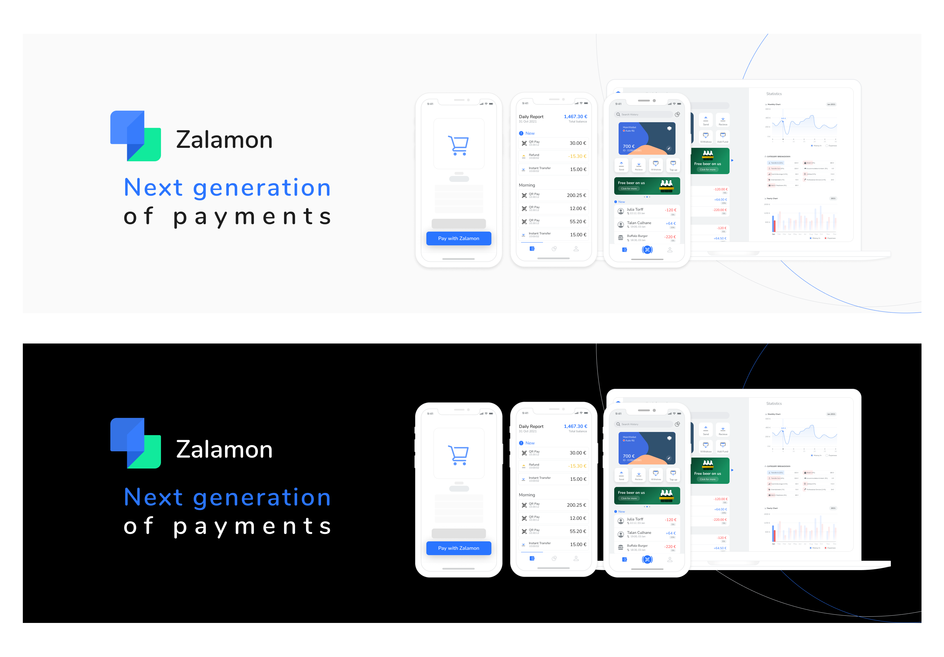
Zalamon Brand
Client
Zalamon
Year
2021
Service
Brang & Logo Design
The Idea
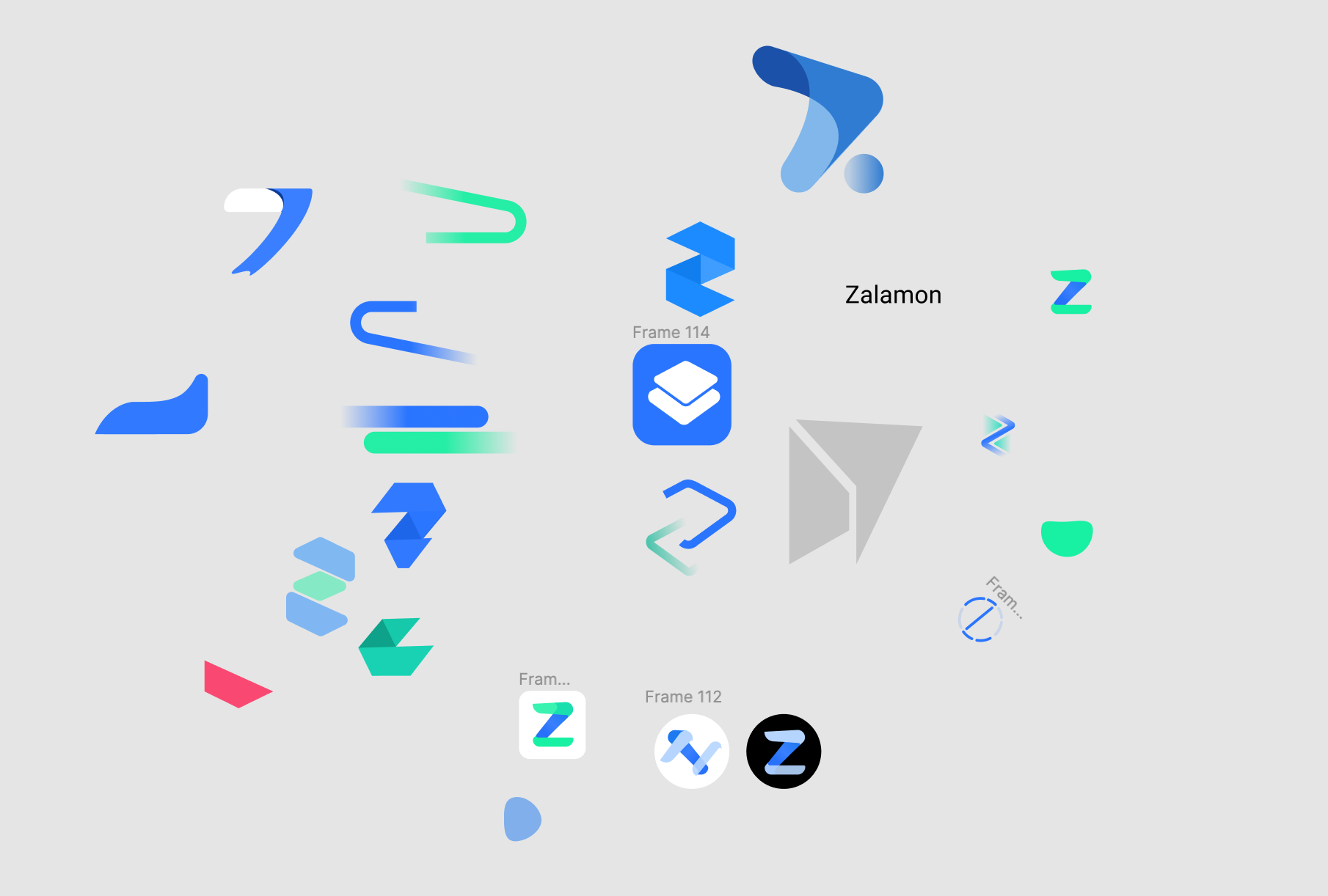
Like any logo design, we began by brainstorming ideas and figuring out what represents Zalamon. A modern-looking logo that has some visuals from traditional wallets.
Our process starts with a few sketches, but only in Letterforms, because that's how we wanted to represent the brand and the name of the brand.
The Process
After hours of sketching, I realized that with hidden techniques I could make a logo that would mimic the design of compact wallets that hold lots of cards.
But we want something modern, something that'll entice young people. Then I started sketching, and the first thing that popped into my head was trying to make the logo 3D. These days, everyone talks about metaverse and EFTs, so having a 3D logo could be cool.
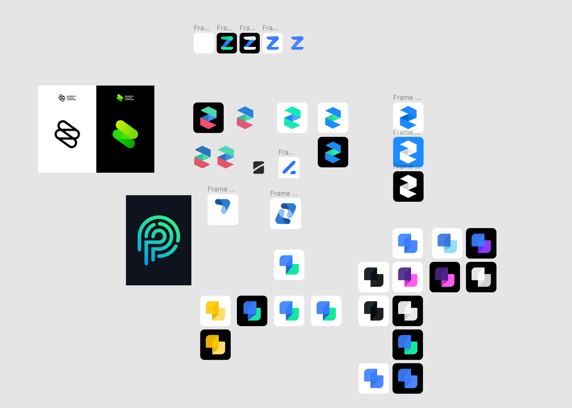
After a few designs, I realized that having a 3D design Z is very challenging. This is because it usually looks a lot like a reversed S. Therefore, I decided to think out of the box and look at this 3D environment differently.
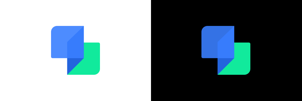
After sketching different angles, I like the top view the best. It's like a foldable traditional wallet and at the same time it's like a Z.
Final Touches
After showing the sketches to the team, almost everyone thought the top-view logo was what we wanted.
Now it was time to make it look better. Considering our product is an app, I decided to bring the logo into the app icon blueprint and recreate it there. Ultimately, the logo looks amazing and we all love it.
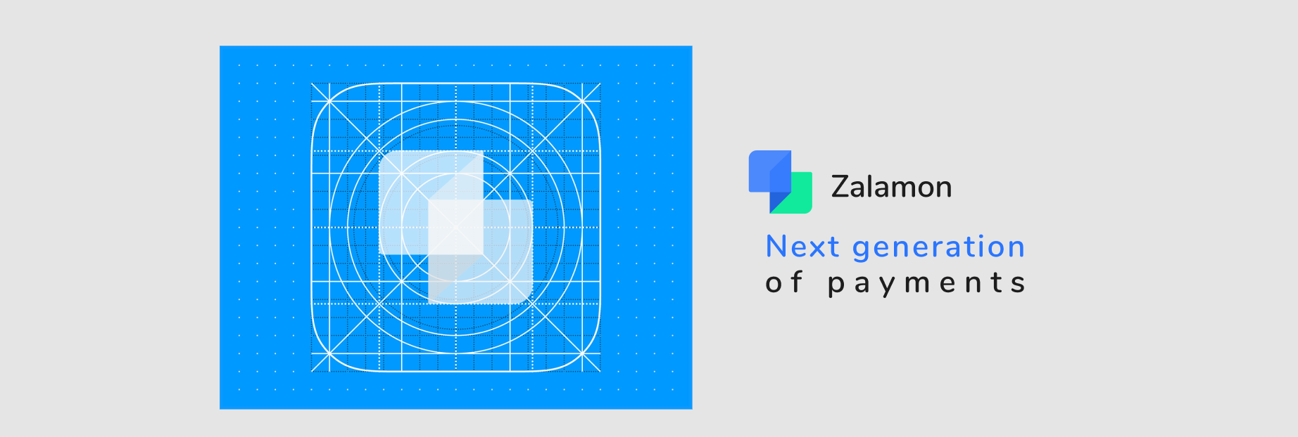
Blue and green were our brand colors. So we chose a shade of blue and green that looks great on both light and dark backgrounds without changing the color codes.
No items found.


Always keen
for a good
collab
